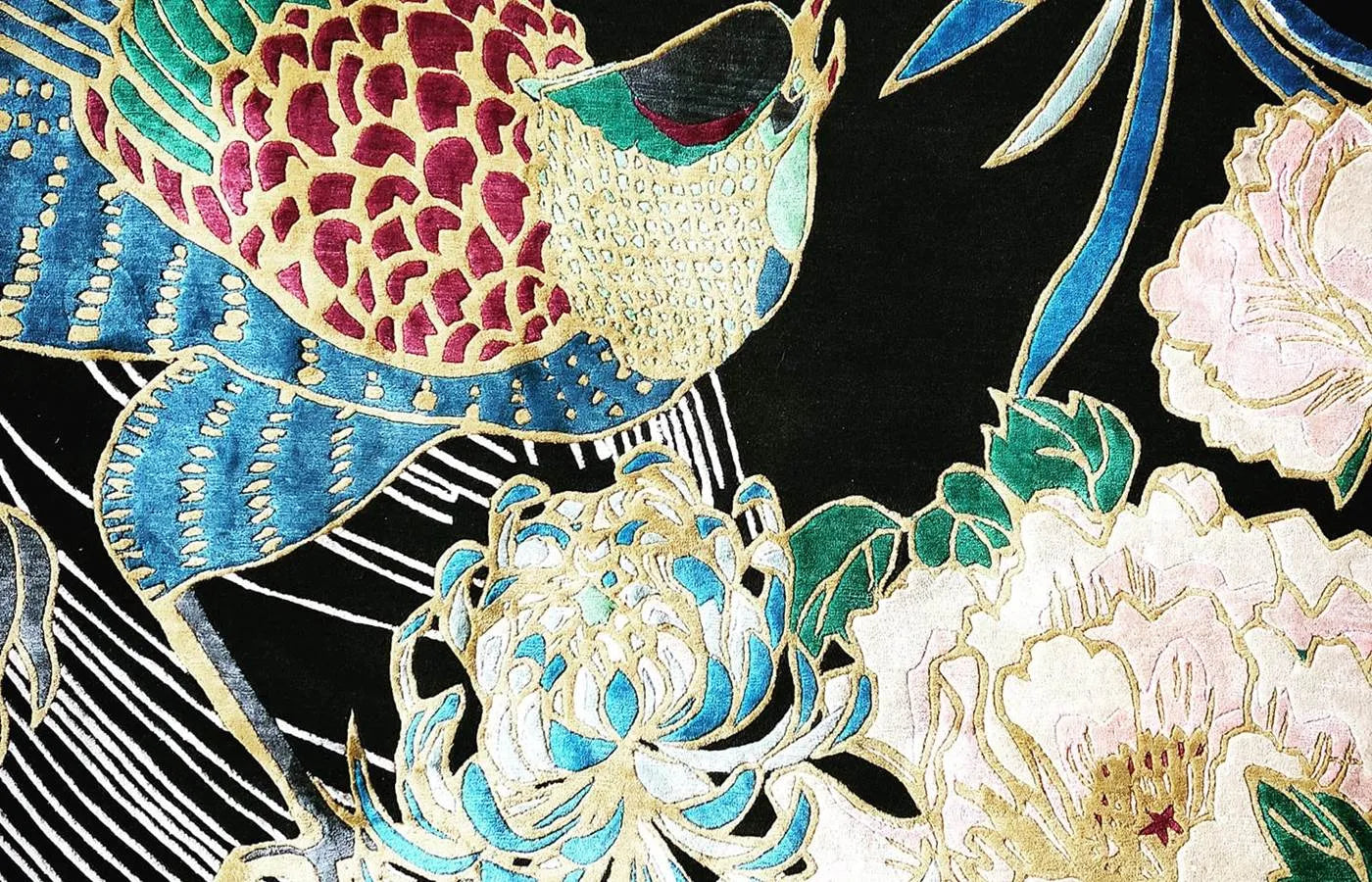
Our Cranes In Trees rug is a versatile choice that can work with many colour schemes; from the classic neutrals to warm greys. Details in crimson, gold and black make this a flexible choice that can work well in both classic and contemporary settings, and which would be particularly flattering in a room scheme where a Chinoiserie influence is desired.

This beautiful emerald green sofa would look stunning in the same room as the Cranes In Trees rug … whether sitting alongside the rug or actually on it! The colour is deeply traditional, of course (think of the new National Trust paint shades from Little Greene) but vibrant and contemporary at the same time. There’s a strong trend for ‘colour blocking’ at the moment, which means using contrasting and clashing blocks of plain colour, and this sofa, and the many other similar ones which are available in teals, orange, red, crimson, gold and so on, would fit well with Cranes In Trees.

This Qing sideboard from The Nine Schools, or something in a similar classic Chinoiserie style, could be another perfect choice for a room featuring our Cranes In Trees rug. It’s black and gilt finish means that it can be considered to be a ‘neutral’, and once again, would fit in well with numerous colour schemes. (By the way, it also comes in white if you’re thinking of a paler scheme …) The design itself is understated and won’t ever go out of style. Imagine it standing against a very dark wall colour … perhaps Off Black or the new Paean Black by Farrow & Ball, with Cranes In Trees in the centre of the room. Bold colour perfection!

Whilst browsing for more colour-block ideas for upholstered pieces to stand out against our rugs I came across the Carla armchair in sumptuous cotton Italian velvet; it’s from the MeliMeli brand by Swedish designer Amelia Widell, and available from Att Pynta. As the evenings draw in, I’m imagining curling up in this gem with a good book! It’s a timeless piece that would be a good investment … in years to come it can be moved around to different rooms; it would be a super bedroom chair as well.

I can easily spend an inordinate amount of time browsing and scrolling through lighting websites; the intricacy of pendant designs in particular, both old and new, is breath-taking. If I’m looking at antique fittings, I’m always amazed at the craftsmanship and detail that was achieved, and with contemporary design I’m thrilled to admire and analyse the modern materials and production methods used. I adore this Bloom Metallic pendant from Kartell, it’s definitely another investment piece, but I feel that it’s so outrageously stunning that it could actually work just as well in a Georgian town-house as in a sleek, modern and spacious architect-designed new build.

I’ve had samples of the Aesop fabric and wallpaper by Linwood on my pinboard for some time now. I absolutely love it, but haven’t quite worked out where and how to use it. But … by pulling all these ideas together today I can see that this design is actually very flexible. There are several pale background shades which can be matched to paint colours (think along the lines of Warm White, Snow and Quarter Mushroom from the Zoffany paint collection at Style Library) for woodwork and cornices etc. I’m rather keen on the idea of a beautiful ottoman or chair upholstered in the velvet, or perhaps a plain, bold coloured item (such as that aforementioned green sofa!) against the Aesop wallpaper. Too many colours, too many ideas!

Checking out the Linwood’s Aesop wallpaper led me to spotting the Island Paradise wallpaper in Charcoal, from their Tango collection. It’s such a bold statement, but again, it lends itself to the possibility of pairing it with equally elaborate or bright patterns, or sticking to a monochrome scheme. It could become a backdrop in a colourful room, whilst still being an interesting talking point. I think it’s one of those ideas that needs a lot of commitment, but the longer you have it in your home, the more you would grow to love it. Here, I love the contrast of the complexity of the wallpaper with the angles of the chair fabric (also from Linwood’s Tango collection).

I couldn’t resist mentioning the gorgeous Finn sofa from Living It Up, I’m imagining it standing against the Island Paradise wallpaper from Linwood. What a combination!

This lovely shot of an Chinoiserie-inspired chair set me off looking for more fabrics and wallpapers which would work with the Cranes In Trees rug. It’s easy to find little chairs like this, and if you have upholstery skills or want to experiment with fabrics, a piece such as this could be a good starting point.

This Dara fabric by Manuel Canovas from Colefax & Fowler fits into a Chinoiserie theme perfectly, and it comes in three colourways. Happily, it’s also available as a wallpaper and in even more colours, including Noir, which has, as expected, a black background.

And finally … we can’t always be planning complete new room schemes, but the addition of a cushion here and there can help pin down a colour theme, and of course, it’s always rather cheering to purchase a cushion! I fell in love with this little gem, and of course, we’ve come full circle and it would add the finishing touch to a room scheme that also featured Cranes in Trees … It’s the Garden des Reves cushion by Christian Lacroix for Designers Guild..
Thanks for reading, Wendy x